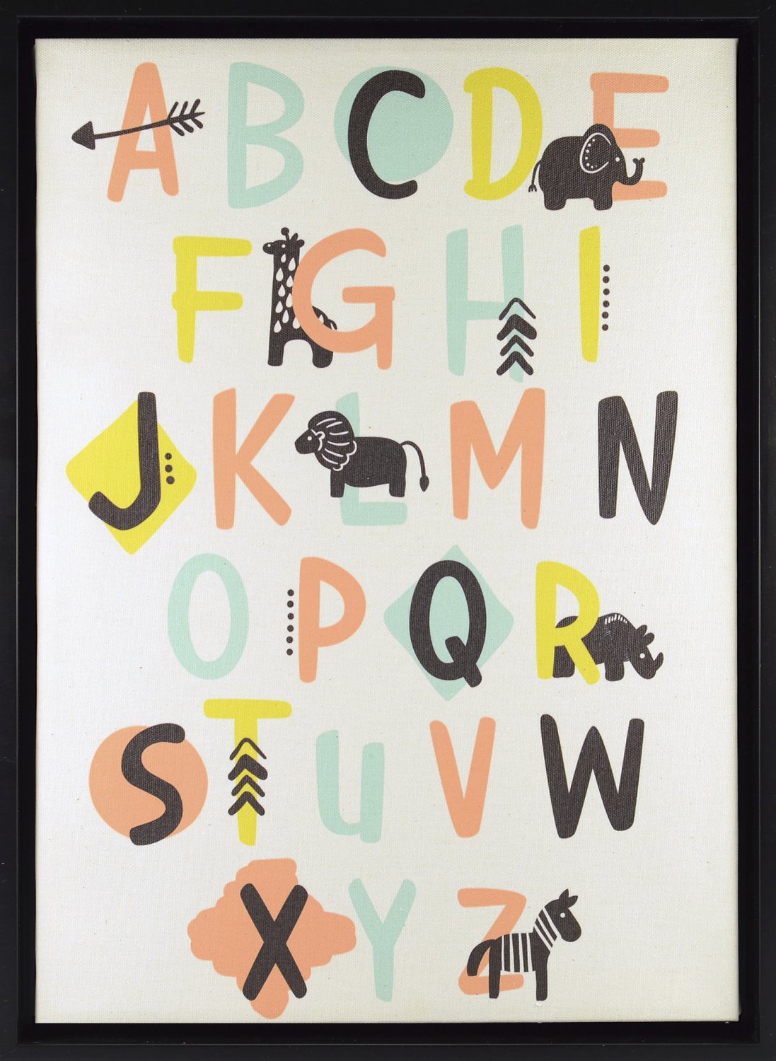
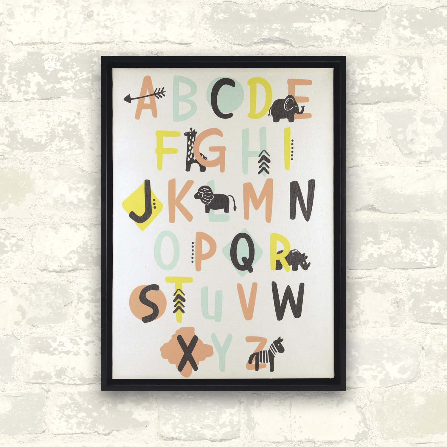
The little explorer alphabet framed linen by Linden Ave. Gives traditional alphabet art a stylish boost from the wilds of the subcontinent. Animal silhouettes of the Serengeti, alongside tribal geometrics and bold capital letters, create a globally inspired alphabet suspended on a white floating canvas with black surround. Printed in semiprecious colors and black for your totally precious preschooler; who says learning can’t be cool
T**S
Cute, with good framing
This is a very cute item that looks quite how I expected it to look, which is a HUGE relief. I say that because the last three paintings I ordered online were a complete wash, with some having materials that were not good and some having sizing issues, and some looking like they were created by rubbing dirt and paper together. That really annoys you in the moment, but it also makes you appreciate when an item comes along and is good.I got this for my daughter, because she is learning to read. She already knows her ABCs, but we are now using associated sounds and images to assist with her progression. Items like this help, too, because she can do something she enjoys, which is singing her ABCs, and she has a visual cue to help her with everything.The framing on this is good, and the design to the framing works really well. It is a recessed design, whereby someone basically inserts a picture into an established frame, and that works for a couple of reasons. First, it creates a nice aesthetic while keeping your eye on the actual art. Second, it helps to protect the item somewhat, with it escaping the "little hand" syndrome. The canvas itself has done well with that; when this first arrived, my daughter had to look at it and touch it, and it did well with that (I am not saying that it is designed to be torture tested, but more to note that it is not paper thin or problematic).One little thing with this; if you look closely, you will see shapes around specific letters. My daughter kept asking me why X had a diamond and why other letters had shapes, and I thought that was a valid point. Why do they? The answer is aesthetics, of course, but it seems like it would have been wiser to pick specific shapes and match them certain letters. This is a small criticism and does not affect scoring, but I thought it was worth noting.
N**E
Nice decoration for a child's place.
This is very cute decor for a child's room. I don't know how educational it is really, as most recommend lowercase letters first (as those are the ones you actually see and use most often), but if you are on to uppercase or as a decoration, it is nice. There are some corresponding animals with some of the letters. I don't know why there are small arrows on the H and the T. I guess they aren't the same as the arrow on the letter a, more like a caret, but I don't think that is a typical "C" word for kids! ha ha! (I know it is just decoration, I was just being silly.)Still, it is a graphic-art-y type of decoration that I think a child might like. It is suitable for both boys and girls. I like that the canvas is like a stretched canvas and that is surrounded by a frame. It makes it seem a little nicer than a cheap framed poster. This would be a nice gift for a shower, especially if you are on a budget or just wanted to give something additional with a more practical gift. I think it would also be nice in a places like doctor or dentist offices to make them more friendly to kids, but still not too "school-y" (and even though I am a teacher, I admit some of that crap is ugly.) I don't see why it is inappropriate for anyone (not just a kid) who is into graphics (it is even a little retro in its color scheme) or typesetting, or educators, or similar fields.
Q**N
Nice Design But Sloppy Delivery/Packaging
First, I am not a fan of how they packaged this. The corners are protected by cardboard, which is nice, but they are stapled to the back of the product. That means after you pull off the protective corner covers, you either have holes or you have staples. Yes, this is in the back where most people won't look but I find it a bit sloppy. The next issue is that the back paper was ripped so someone put brown repair tape over the rips. Again, no one is looking on the back, but I found it a bit unprofessional.Now for the front. The front looks very good just as pictured. The colors look accurate. And the stretching and alignment were done well. I only wish there were more items and animals with the letters, but overall, I think the design is clean and will attract my child's eyes once he gets older.
O**D
sloppy and unattractive
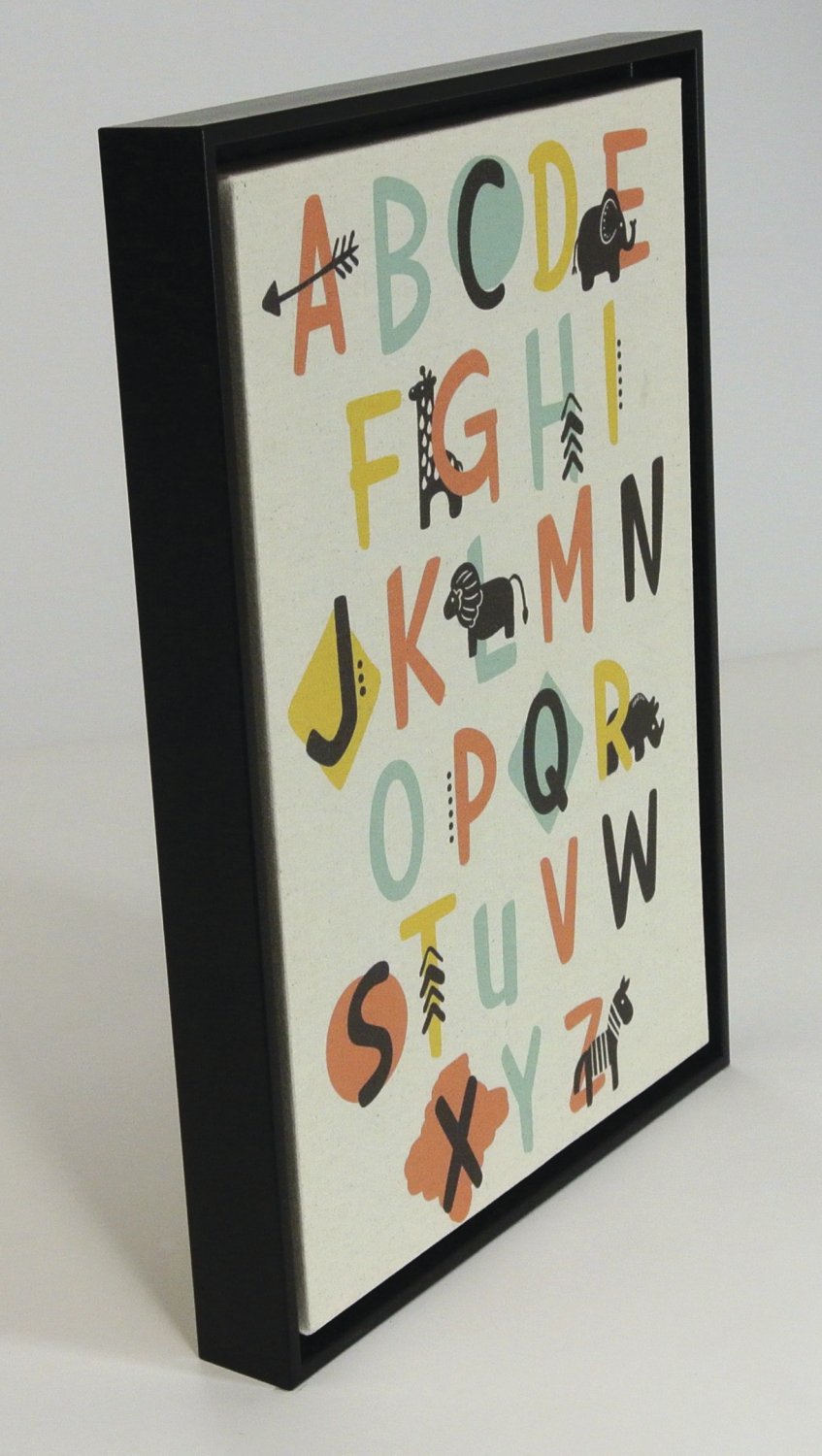
I love the concept, and the use of simple graphics to highlight random letter sounds in the alphabet. The black frame is sturdy, well-fitted together and striking. It has a cardboard back and a metal nail slots on the two sides for hanging it. It is nice that it's so secure with the two nails, but honestly, it's not only overkill (it's not heavy enough to require two nails, and you now have two holes in your wall), but it's a pain to get them perfect so it's not off kilter. I much prefer a simple top-center-fixed horizontal hanger bar with teeth that allows you to slide it into a centered and balanced position and adjust as needed.But more to the point, the actual print is not to my liking. First of all, the canvas was not properly stretched taut on the frame, so it's wavy looking, and a little sloppy. Second, the background color is rather bone or cream, not the white or even eggshell that it seems to be from the product image. For me, the resulting color combination just doesn't "pop." It looks very 70's tan/orange/green/brown/hemp, and won't complement any decor that I'm likely to find in our grandkids' rooms, which is what I had intended it for. I'll donate it to a shelter, perhaps.
M**X
Simple and sweet. Floating canvas gives it a nice little touch
This is a canvas mounted inside a frame, giving it a bit of a shadow box effect. Looks better in person, you can't really see the effect from the product photos. There's about 1/3rd inch space between the canvas and the frame.The minimalist design is supposed to give the effect of an unfinished/unprimed canvas (natural tone). It appears to be the alphabet is just laid on top of a blank canvas (printed, actually), then the whole thing is given a clear coat. I like the effect, super cute.Don't expect fine art here, but this is perfect for a nursery, childrens room, etc Not a huge investment in case it gets dinged up (just a reminder this is canvas, you could punch a hole in it fairly easily). The price (currently $16 Prime) is in line with what we see in craft stores and baby stores, maybe even a little less expensive, and a bit nicer at the same time. If you're going to decorate, don't buy a boring one-dimensional mounted piece, something like this is a lot more fun.
Trustpilot
2 weeks ago
2 months ago
