Desert Online General Trading LLC
Dubai, United Arab Emirates
Desert Online General Trading LLC
Dubai, United Arab Emirates

Full description not available
R**N
Noticeboard creativty
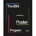
IBM build up a reputation for design excellence, whether it was a computer or, as this book shows, employee communication. There are just over a hundred interesting posters in this book, a good selection of the more than five hundred that were produced in the fifteen-year life of the design studio at the IBM Boulder, Colorado building.Three internal staff designers, John Anderson, Tom Bluhm, Ken White and photographer Rodger Ewy created these posters for staff noticeboards. These weren't ad posters with big budgets for design, photography or illustrations, instead the designers had to come with visual ideas that worked for a range of themes like: health and safety; security; product announcements; events; quality and excellence; management development; savings bonds. Obviously, some themes are difficult to illustrate so several posters are just typographic. For example, a security poster just said 'Badger the Badgerless' or for equal opportunity 'pEOple. Within all of us. Equal OpportunityThe posters were all the same size, fifteen by twenty-one inches and printed silkscreen or litho in Denver with runs of up to two thousand and distributed to various company buildings around the US. The book has most of the posters one to a page with some background material about the programme and the three designers fill the first few pages. Roger Ewy sums up the success of these posters because so many of them were removed by the staff to take home. Look inside the book at Westread Book Reviews then click 2021 and March.
S**A
Paul Rand will be turning in his grave
Don't for one minute think the poster designers at IBM Bolder represent the design standards of the IBM Corporation in any shape or form. The cover is a typographic joke, which befits the appalling content.
Trustpilot
3 days ago
3 weeks ago